How to “Properly” Convert Negatives in Lightroom: A Step-by-Step Guide
Converting film negatives to digital images can seem daunting at first, but with the right approach, you can achieve accurate and beautiful results. In this tutorial post, I’ll walk you through the process of converting negatives in Adobe Lightroom, covering everything from the initial setup to the final touches of color correction. If you’ve ever struggled to get the colors right or ended up with cold, blue-toned images, this guide is for you.
Unlike digital photography, film negatives are not straightforward to process. The orange base of the film creates challenges in achieving accurate colors, especially if you’re not aware of how to handle white balance and tone curves effectively. By following the steps below, you’ll be able to unlock the true potential of your negatives and bring out their inherent beauty.
example 1.2
Step 1: The Importance of White Balance
The very first thing I do when working with negatives in Lightroom is adjust the white balance. This step is critical because the film itself has an orange tint. If you invert the film without addressing the white balance, the entire image will take on a cold, blue tone. Here’s how to fix it:
Select the Border for White Balance
Before inverting the image, use the white balance tool in Lightroom to sample an area on the border of the negative—where there’s no image. This border represents the film base and provides the best neutral point to correct for the orange tint. (example 1.1)
This step ensures that the orange base doesn’t influence the colors of the final image. If you skip this step the photo will come out super cold toned. (example 1.2)
Why White Balance Matters
Proper white balance sets the foundation for the inversion process. Without it, your colors will be off from the start, and it will be much harder to correct them later. Taking the time to address this upfront will save you frustration down the road.
example 1.2
Step 2: Inverting the Negative
Once the white balance is set, it’s time to invert the negative into a positive image. This is where the magic starts to happen. I prefer to use the Tone Curve tool in Lightroom for this process, as it allows for precise control over each color channel.
Access the Tone Curve Panel
In Lightroom, navigate to the Tone Curve panel. You’ll see a graph with diagonal lines representing the tonal values of the image.
Invert the Red, Green, and Blue Channels Separately
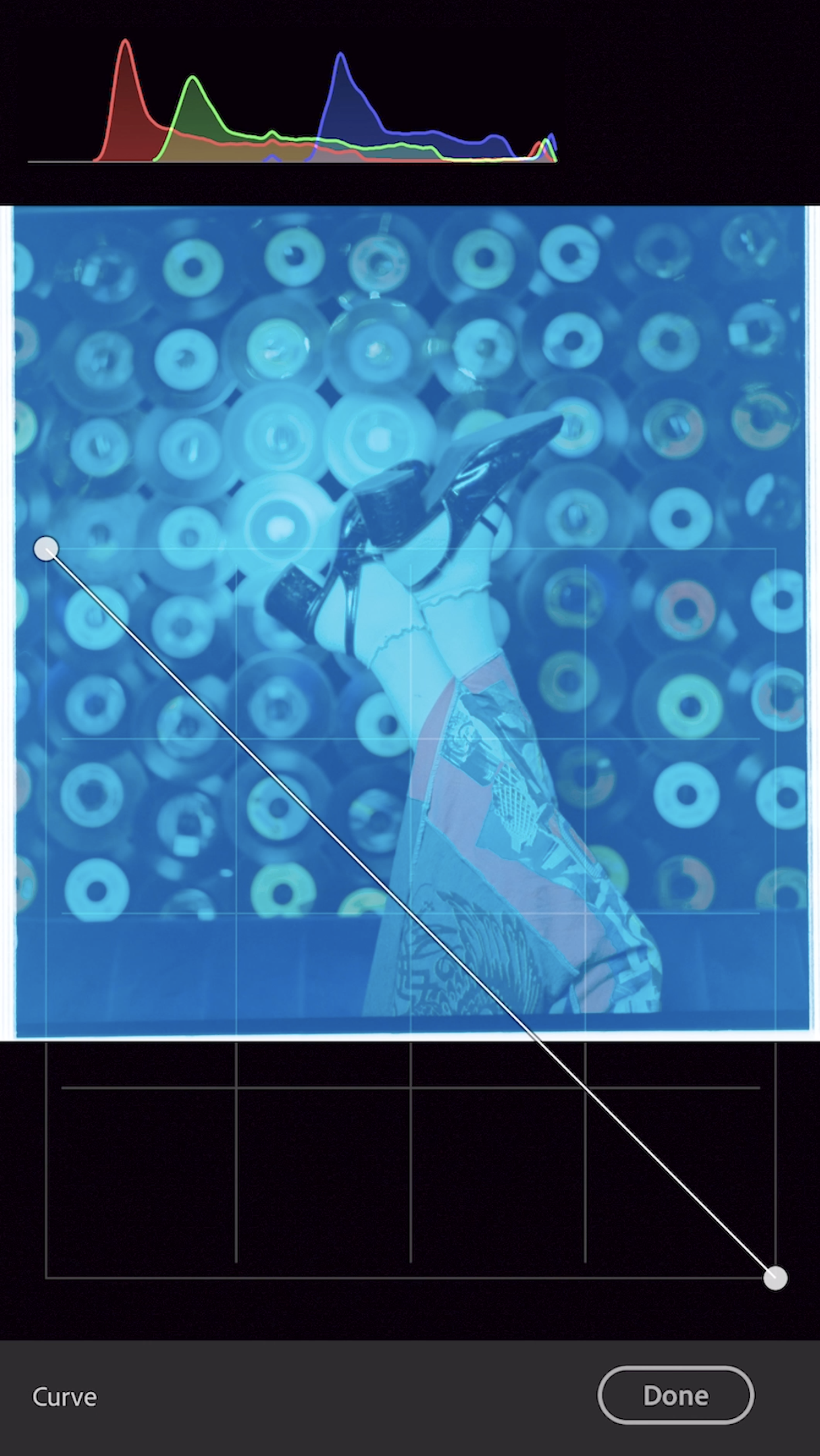
Start with the main RGB curve. Drag the bottom left point (the shadows) all the way to the top left, and the top right point (the highlights) down to the bottom right. This creates the basic inversion.
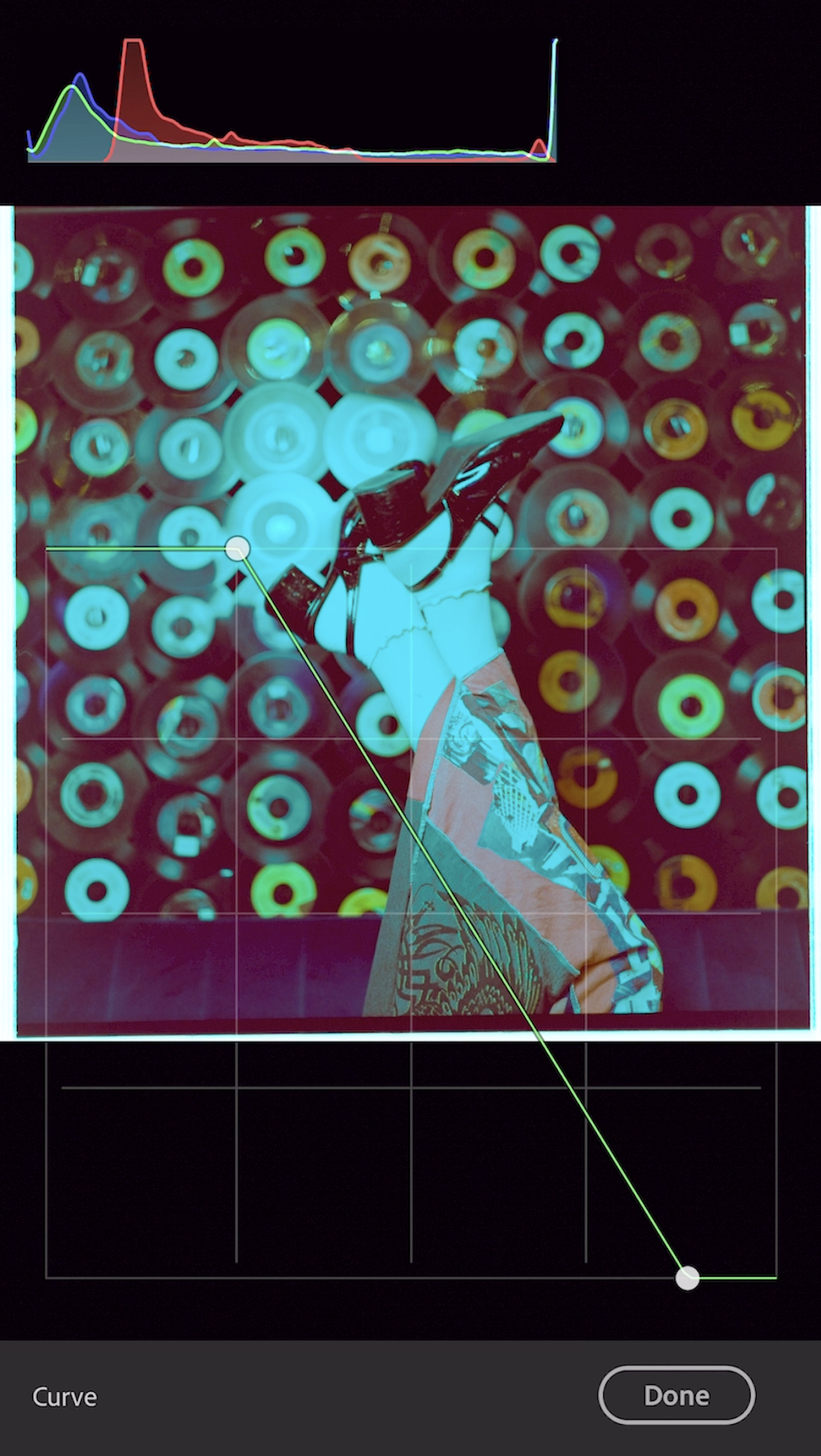
Next, move to each individual color channel (Red, Green, Blue) and repeat the process.
Why Separate Channels?
By inverting each channel individually, you’ll have more control over the final colors. It allows for fine-tuning that ensures greater accuracy compared to working with the main RGB curve alone.
example 2.1
example 3.1
Step 3: Managing Dynamic Range
Film negatives have a unique character, but their dynamic range is narrower than that of digital sensors. Understanding this limitation is key to achieving the best results.
Limit Highlights and Shadows
As you work with the tone curve, be mindful not to push highlights or shadows too far. Overextending the tonal range can lead to clipping, which reduces detail and makes the image look unnatural.
Use the Histogram for Guidance
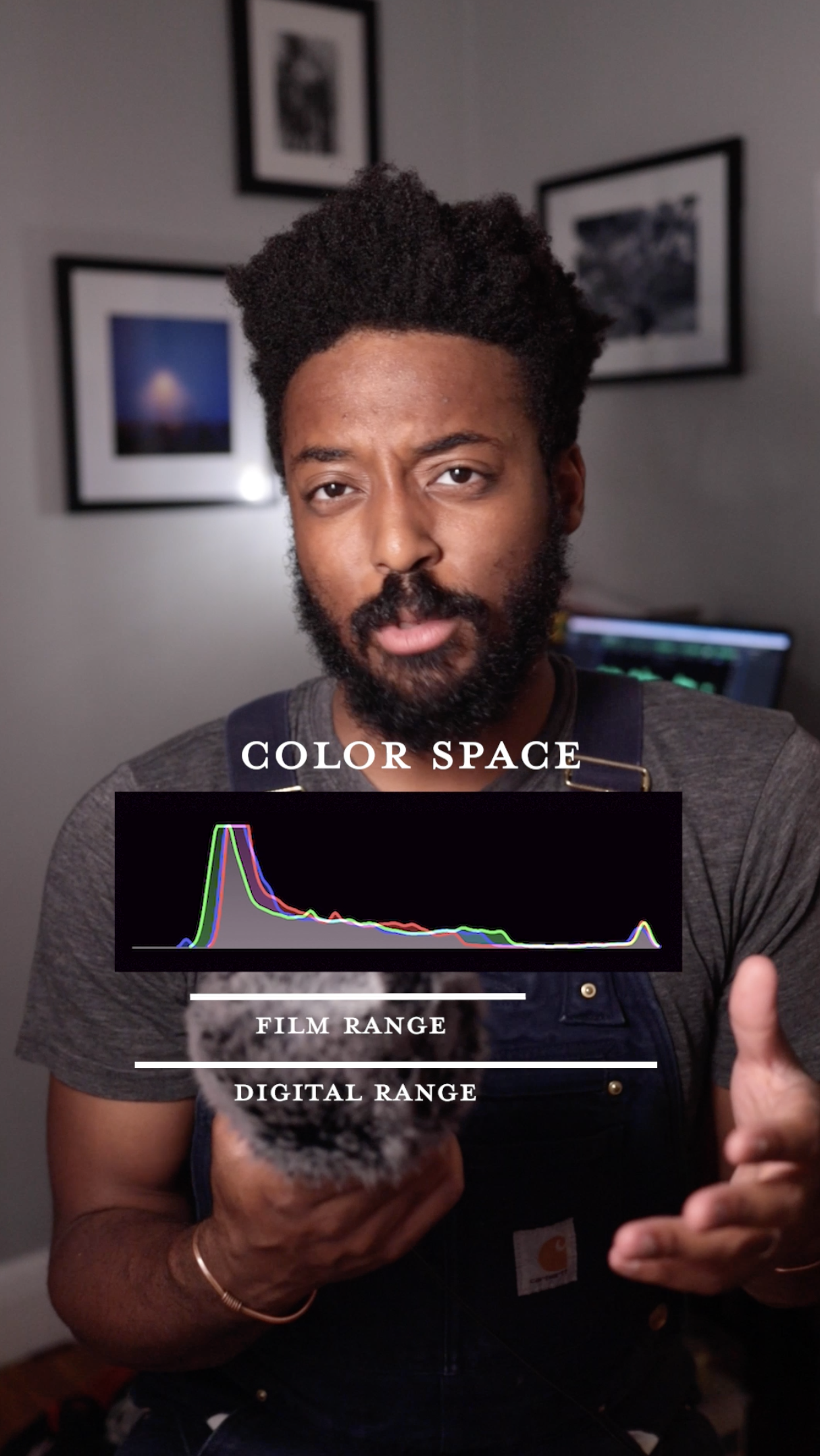
The histogram is your best friend during this process. Film negatives have a more limited dynamic range compared to digital sensors, so it’s essential to keep highlights and shadows within the film’s range. This ensures you don’t lose important details in either the bright or dark areas of your image.
The histogram provides a visual representation of the tonal distribution in your image. Aim to keep the peaks and valleys within the middle range to preserve details and avoid harsh transitions.
Balance is Key
Adjust the midtones carefully to maintain a natural look. Film often has a softer, more gradual tonal roll-off compared to digital, so keep that in mind as you make adjustments.
Density
Go to the sliders and adjust the exposure for density. What you’re looking for is a place where you can see all of the detail in both the highlights and the shadow. The image may look a little washed out, but that’s okay.
Use the highlight and shadow sliders to adjust for fall off. Some people like the washed out film look. I do not. I like my blacks to be BLACK, and my whites to be WHITE. Keep in mind that a “good” photo has the full range of lights and darks. So don’t be afraid to loose a little detail in the shadows and highlights.
This step can be awkward because it’s the first time you’ll mess with the sliders. remember that you’re still working with a negative. all the controls in Lightroom will be reversed.
example 4.1
Step 4: Fine-Tuning the Colors
After inverting the image and managing the dynamic range, the next step is color correction. This is where you can bring out the true beauty of your film negative. You can use the curve to do this by applying curve points. But I prefer to use global sliders because they’re easy and accurate. For the sake of this step by step guide, I’ll be going over the sliders that are best to use.
Start with Global Adjustments
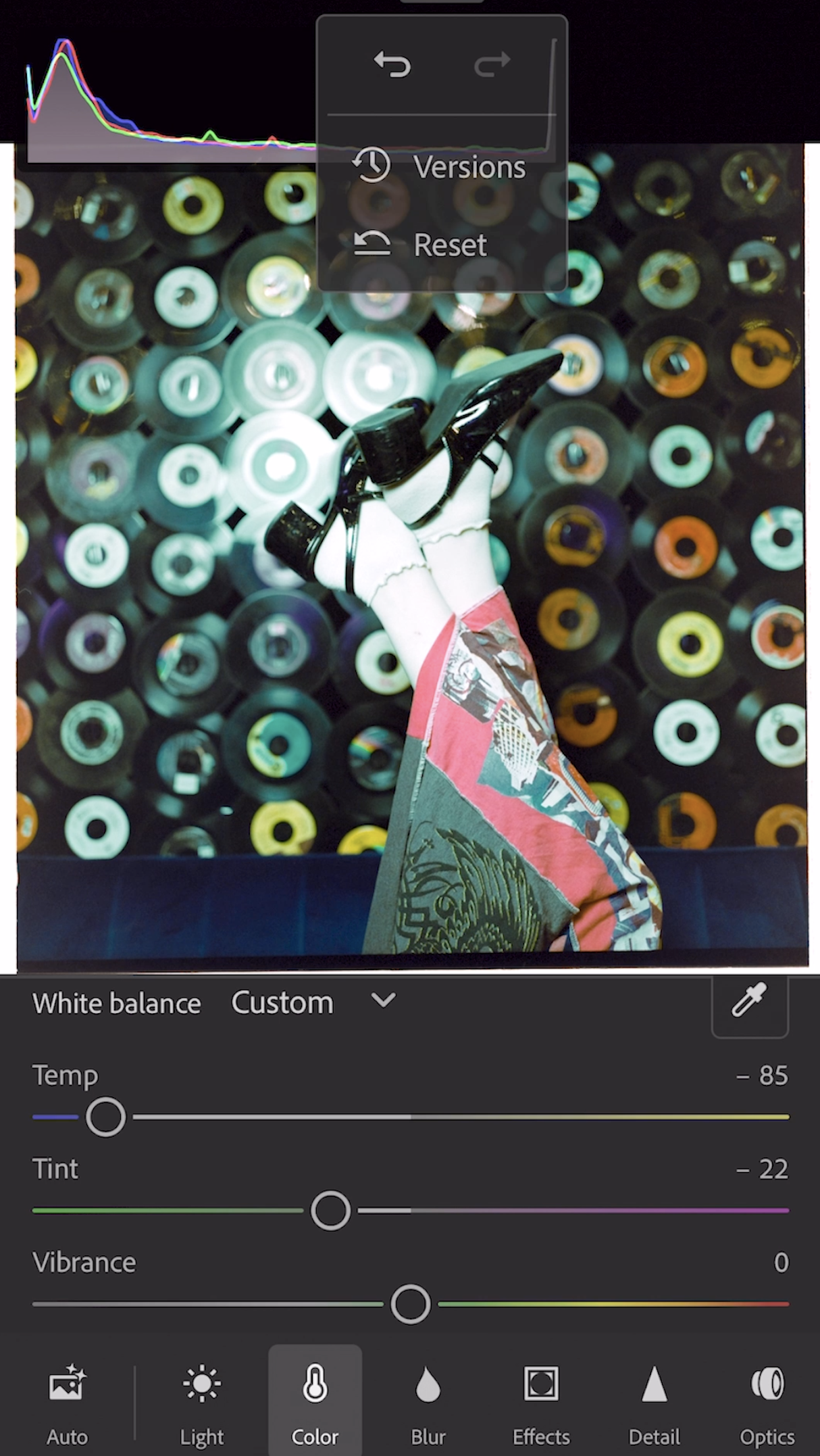
Use the Temperature and Tint sliders to make broad adjustments to the overall color balance. This helps neutralize any residual color casts from the inversion process. Also, remember that you are STILL working on a negative! that means that moving the temp slider to the right makes the image colder.
Keep in mind that temp and tint often work in opposite directions. To make an image warm, you add more cool temp, and add more magenta. To make an image cold (and to balance out light complected skin tones) you move the temp slider to the right and add more green. This isn’t always the case, but it is super common.
You can use HSL sliders, but try to avoid saturation and
Focus on Skin Tones (if applicable) - Skin tones should always be your priority. even if the skin doesn’t look like skin, it should look the way that you want it to. If your image includes people, prioritize skin tones. They are often the most noticeable aspect of an image and can make or break the final result. Adjust the HSL (Hue, Saturation, Luminance) sliders to ensure skin tones look natural.
Preserve the Film’s Character
Remember, part of the charm of film is its unique color rendition. Resist the urge to over-correct and embrace the subtle imperfections that make film photography special. Over editing can easily make a film photo super tacky. Try to keep your adjustment as simple as possible.
Why This Process Works
If you follow these steps in order, you’ll achieve accurate colors and retain the character of your film negative. The combination of proper white balance, tone curve inversion, and dynamic range management ensures that your images look true to life while showcasing the unique qualities of film.
Final Thoughts
Converting negatives in Lightroom doesn’t have to be a frustrating experience. By taking the time to understand the nuances of film and following a structured approach, you can create stunning images that honor the artistry of analog photography. Whether you’re capturing landscapes, portraits, or everyday moments, this method will help you bring your negatives to life.
If you do use this guide successfully please let me know!! Send me a DM on instagram, I’m dying to see your results!!


